
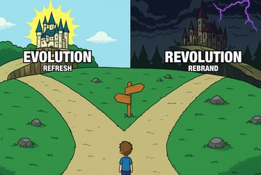
Brand Evolution, or Brand Revolution?
At some point, every business hits the same crossroad. Do we give our brand a quick refresh, or go all in with a full rebrand?
A brand evolution uses small updates like cleaner fonts, fresh colours, or a polished logo which keeps things familiar but up to date. A brand revolution is a complete redesign which can send a bold message that you’re moving in a new direction. Both can work, but the right choice depends on your audience, your goals, and how much risk you’re willing to take.
In this article, we’ll break down the pros and cons of each, with real-world examples like KIND Snacks, Evri (formerly Hermes), and Jaguar. If you’re wondering whether your brand needs an evolution or a revolution, this guide will help you figure it out.
What is a Brand Evolution, and when to choose it?
A brand evolution is all about subtle updates such as modernising fonts, refreshing colours, and tidying up a logo. This keeps your brand updated without losing what people already know and love about your brand.
Why it works:
Keeps recognition intact: customers will still recognise you at a glance.
Lower cost and lower risk: often quicker to roll out than a full rebrand.
Shows you’re current: little tweaks show progress without making waves.
What to watch out for:
Too subtle to notice: if the changes are tiny, it may not solve bigger problems.
Limited impact: a minor tweak won’t completely reposition your business if that’s what you need.
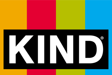
Good example: KIND Snacks
KIND released a minor refresh to their logo and packaging. The new logo extends the four colours and contains the word KIND within the shape. The new design makes the logo easier to work with for designers while appearing more vivid.
The new packaging is brighter, cleaner, and easier to spot on shelves. The subtly updated colours and fonts give it a modern feel, while keeping the familiar transparent window fans love. The design grabs attention and clearly shows what’s inside, without losing the brand’s personality.
Bad example: Johnson & Johnson
Johnson & Johnson updated their brand in 2023 changing from their longstanding recognisable script font to a simplified sans-serif. The design was meant to signal the new future for the brand and become easier to use in digital spaces. The new wordmark felt like an oversimplification and blended in with the minimalist trend that many other brands followed leaving it lost amongst the crowd.
What is a Brand Revolution, and when to choose it?
A brand revolution means tearing up the rulebook and starting afresh. It’s bold, it’s risky, and it’s often needed when your business has outgrown its old look or wants to refresh its perception.
Why it works:
Instant impact: a dramatic redesign grabs attention.
Perfect for big change: if your business, audience, or values have shifted, a revolution makes the outside match the inside.
Fresh energy: a rebrand can reset perceptions and re-engage your audience.
What to watch out for:
Risk of backlash: if people love your current branding, they may not welcome a total overhaul.
Expensive and time-consuming: everything from signage to stationery will need replacing.
Takes time to rebuild recognition: it’s basically starting brand equity from scratch.
Good example: Evri
In 2022 Hermes rebranded as Evri. A smart move that helped the company shake off a reputation for poor service and start afresh with a new identity. The new name and look made it clear they were aiming to be more modern, reliable, and customer-focused. It gave them a chance to rebuild trust, stand out from competitors, and show people that change was really happening behind the scenes.
Hermes had a dated image and a poor reputation, so rebranding to Evri gave them a much-needed fresh start. The new look feels modern, friendly, and more in touch with customers, helping rebuild trust and stand out from their competitors.
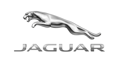
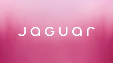
Bad example: Jaguar
Jaguar launched their rebrand with great ambition. Their announcement titled "Copy Nothing" should have been the start of a powerful era positioning Jaguar above the rest, in a position where nobody could copy their quality, or that they did not need to copy anything from their competitors. Instead, Jaguar blended into the crowd with a generic, minimalist identity which lost the luxury cues and emotional connection that long-time customers associated with Jaguar.
The new direction felt cold and corporate, which clashed with the craftsmanship, heritage, and aspirational image the brand had built over decades. Instead of exciting their loyal customer base, it left many feeling alienated, as if the brand was trying to be something it wasn’t.
Logo Redesign vs. Brand Refresh: how to decide
Still unsure whether to evolve or revolutionise? Ask yourself:
Do customers recognise and trust your current brand?
Yes? → Evolution might be the safer bet.
No? → Revolution could be the reset you need.
Has your business changed direction?
New audience, products, or values? → A revolution will help communicate the shift.
Same direction, just a little dated? → Evolution will modernise without alienating.
Feeling risky?
Conservative approach? → Small tweaks.
Ready to shake things up? → Full redesign.
Final thoughts
At the end of the day, there’s no one-size-fits-all answer. Brands like KIND Snacks show how subtle tweaks can keep a look fresh without losing recognition. On the other hand, Evri proves that bold change can be the perfect reset when a business needs a clean slate. And then there’s Jaguar. A reminder that not every redesign lands well, especially when it drifts too far from what loyal customers love.
The most important thing? Whether you choose evolution or revolution, your brand update should tell the story of where your business is heading and not just where it’s been.
Thinking about a rebrand?
Let’s chat about whether evolution or revolution is right for you.
All logos, trademarks, and images used in this article are the property of their respective owners. They are used here for illustrative and informational purposes only.


Kind Snacks old and new logo © MARS 2025

Johnson & Johnson old and new logo © Johnson & Johnson 2025
Hermes and evri logo © evri 2025


Jaguar old and new logo © Jaguar Land Rover Limited 2025