Mobily
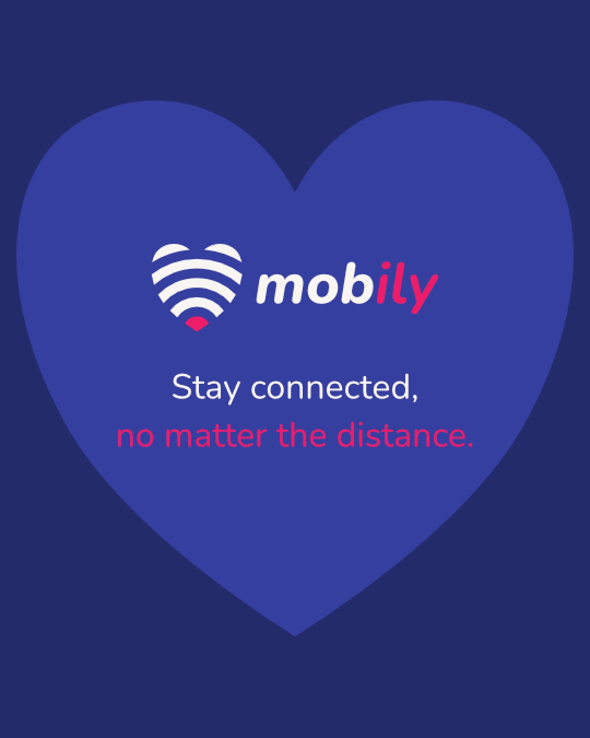
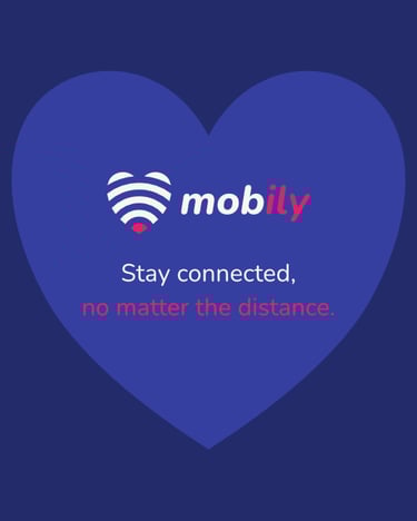
Mobily is a mobile network provider who strongly believes in family and personal connections. Mobily's tagline is "stay connected, no matter the distance", a direct message about it's core beliefs.
Mobily were looking for an updated identity that shouted about their values of family-focused, personal connections, inclusivity, and affordability.

The idea
The concept for Mobily's identity was inspired by both their values and their name. Taking the second half of the name gives you "ily", a common acronym for "I love you". I ran with the idea of love as this was central to everything Mobily do. They love family, friends, connections so the theme was perfect to convey their message.
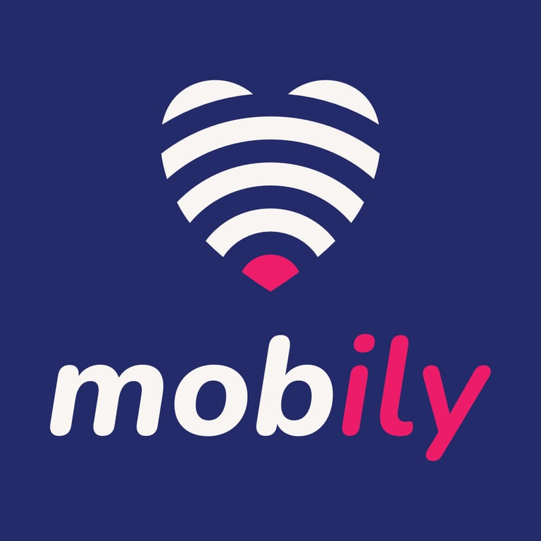
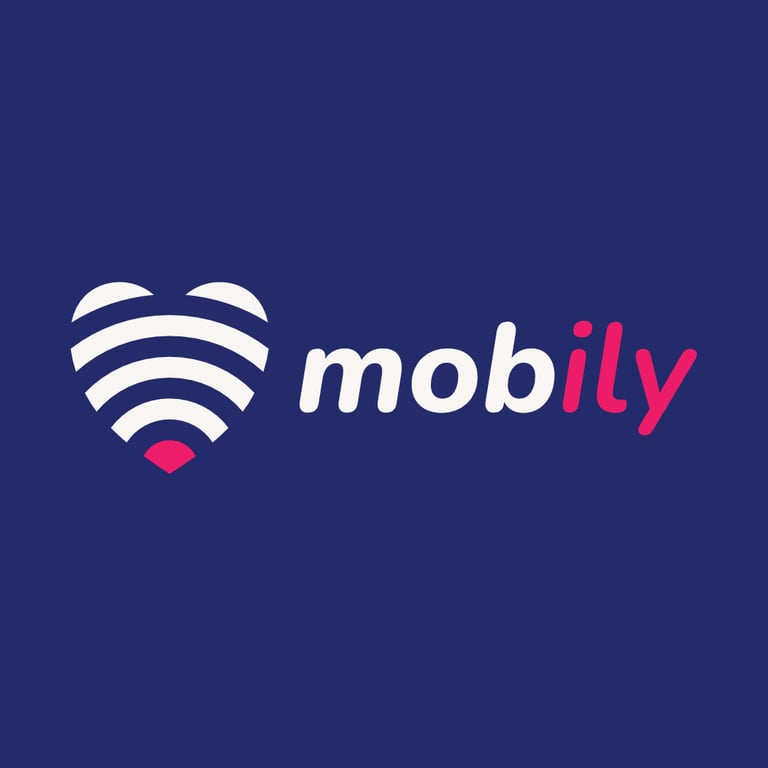
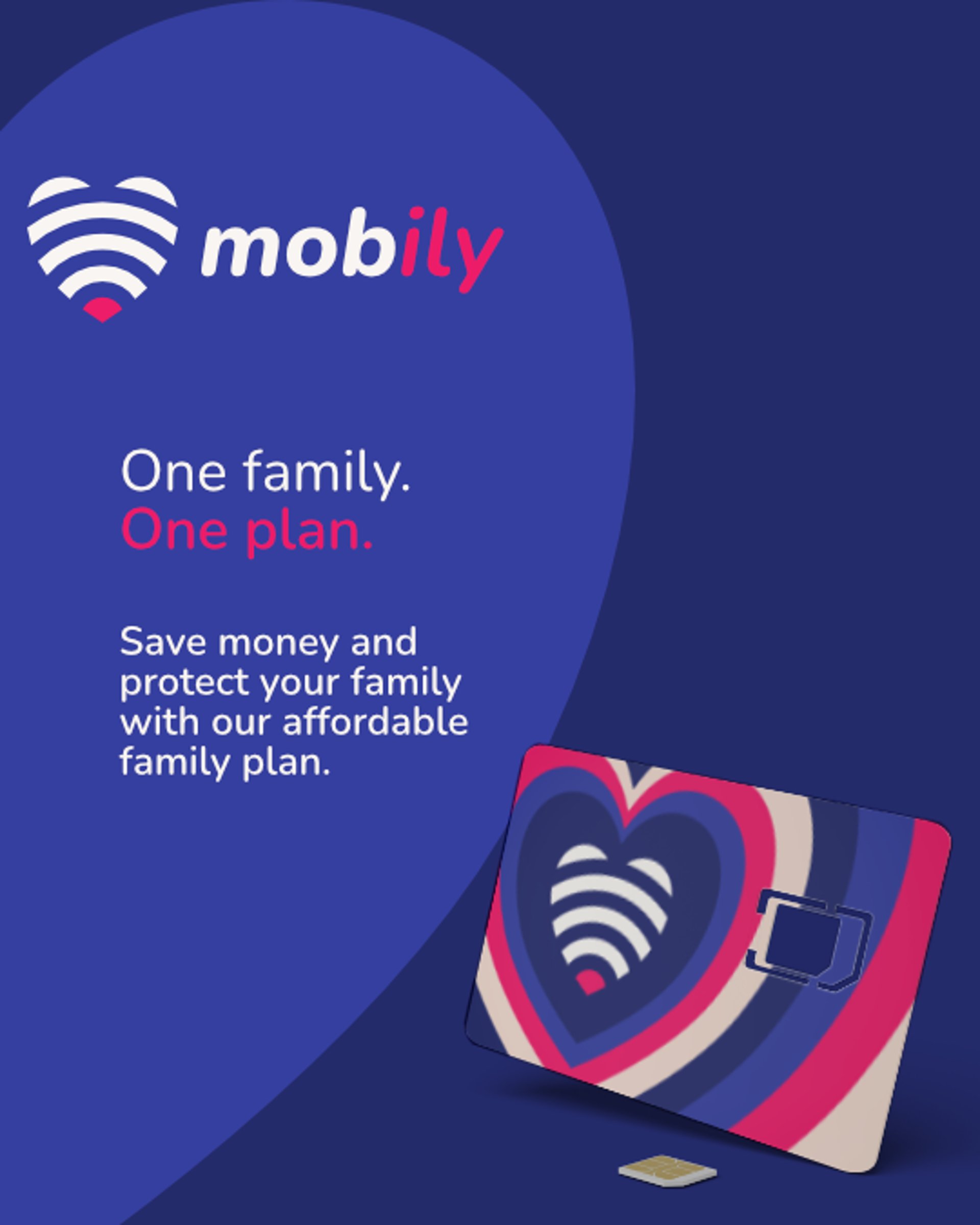
The brand's logomark is a heart made to look like mobile network bands. This appearance instantly sparks the idea of WiFi, data, and connectivity. The colour scheme is focused around two shades of blue, that represent calmness and security, and a vivid raspberry to represent love. The raspberry is used to highlight "ily" in the wordmark, and used at the core of the logomark. The raspberry highlight is used throughout communications to emphasise messages.

Marketing communications
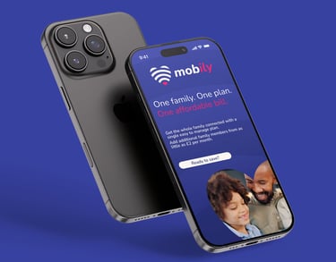
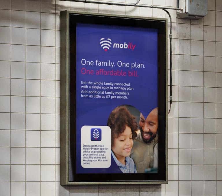
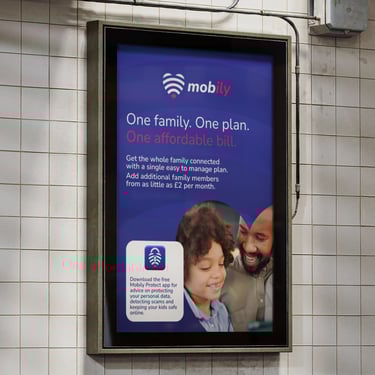
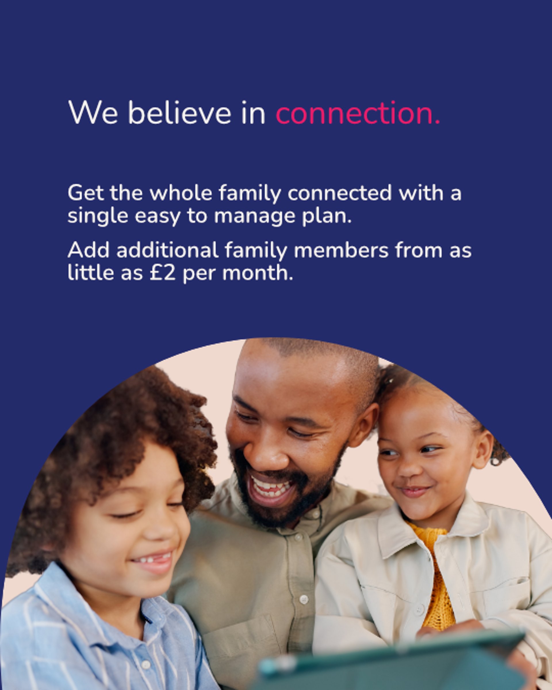
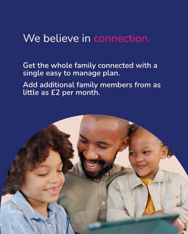
Alongside the brand identity, Mobily wanted a range of digital and print advertisements for their new family plan. The plan allows families to add additional members for a low price while keeping billing as simple as possible.
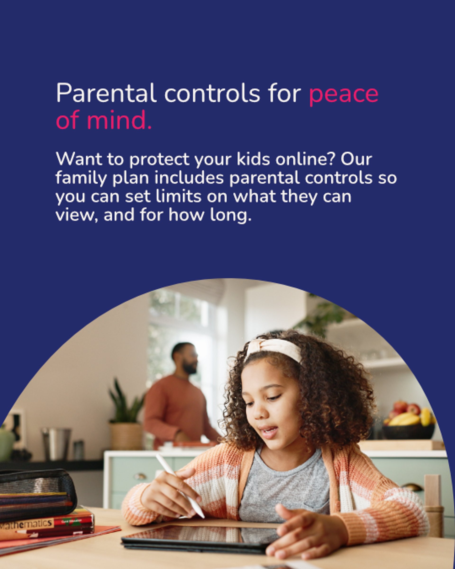
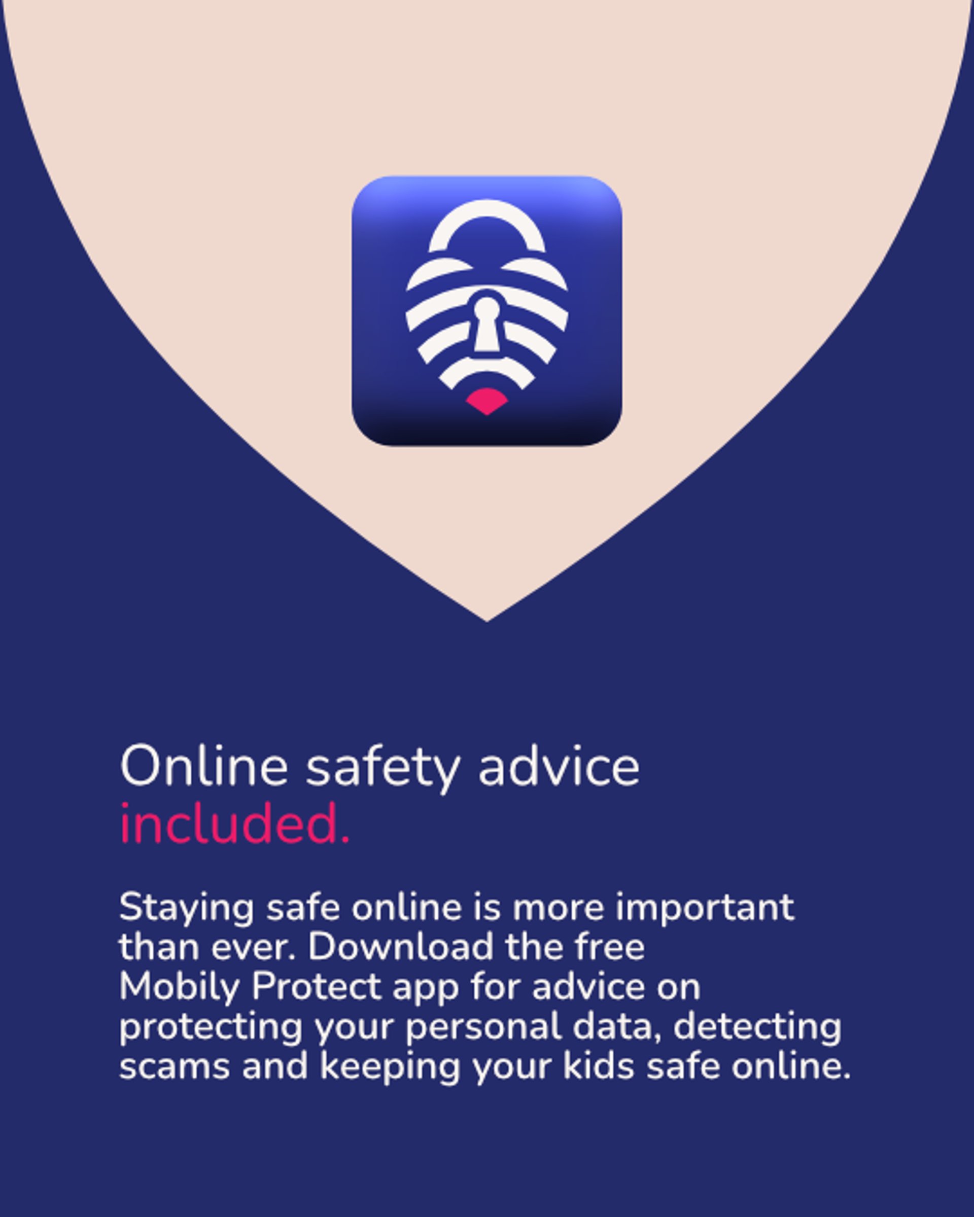
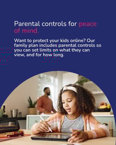
They also wanted a secondary message about their Mobily Protect app. The app is free to download, even for those without plans and offers advice on protecting personal information, detecting scams, and keeping kids safe online.


Social media carousel
Mobily Protect
The logomark for Mobily Protect takes the main logomark and adds elements to signify the apps meaning. The mark has the appearance of a padlock or locket, and signifies the meaning of keeping the ones we love safe.